
文章图片
The event organizer, the Japan Association for the 2025 World Exposition, unveiled the creation on March 22. It was chosen out of 1,898 mascot designs submitted in a public competition.
2025年日本世界博览会协会于3月22日公布了这一吉祥物设计创意 , 它是从1898个竞选方案吉祥物设计中挑选出来的 。
The winning design was created by a Tokyo-based group of designers called "mountain mountain," led by designer Kohei Yamashita. A screening committee's 11 members including graphic designers chose it from the final three candidates.
被选中的吉祥物设计由东京设计师团队“mountain mountain”创作的 , 设计师山下幸惠(Kohei Yamashita)是该团队的领导 。
The official mascot has a blue body that carries the expo's bright red logo on its head. Its blue body represents water and the ability to change shapes. The logo is comprised of red cells, embodying the "brilliance of life." The group of designers said the theme of the mascot is the "potential for diversity and change."
吉祥物身体呈蓝色 , 头部带有世博会的鲜红色标志 。 它的蓝色身体代表水和改变形状的能力 。 标志由红细胞组成的 , 体现了“生命的光辉” 。 该设计团队表示吉祥物的主题为“多样性和变化的潜力” 。
会徽以及吉祥物形象引发大众联想
【mascot2025年大阪世博会选中了哪个吉祥物?】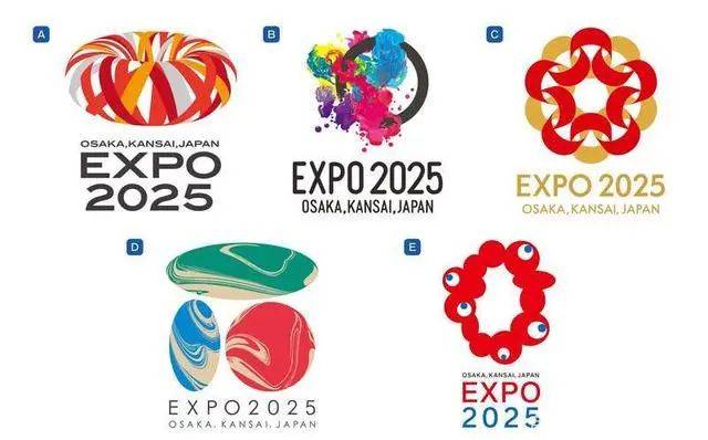
文章图片
In 2020, Japan officially announced five Expo emblems that may be adopted. This is the final emblem selected
2020年 , 日本官方公布了可能被选用的五个世博会会徽 。 这是最终被选中的会徽 。
文章图片
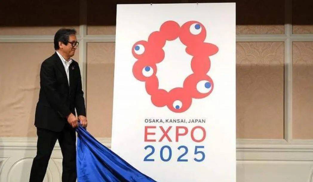
When the logo was unveiled by the association on Aug. 25, critical messages poured in online, describing it as “the worst (among the five final candidate designs).”
当日本协会于2020年8月25日公布该会徽时 , 网上涌现出大量批评信息 , 称其为“最差的(在五个最终候选设计中)”
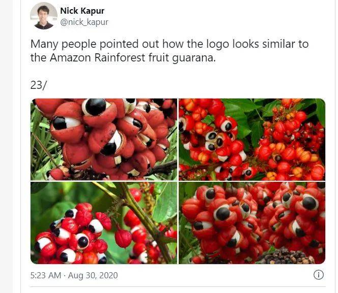
the emblem released has aroused the imagination of Internet user.Here are some inspirations from Twitter.
会徽的形象引起了网民的联想 , 以下是一些推特用户发布的与吉祥物有关的内容 。
文章图片
“Many people pointed out how the logo looks similar to the Amazon Rainforest fruit guarana.” Nick Kapur commented in 2020.
“很多人指出这个logo像亚马逊雨林产的水果瓜拿那”Nike Kapur在2020年如是评论 。
文章图片
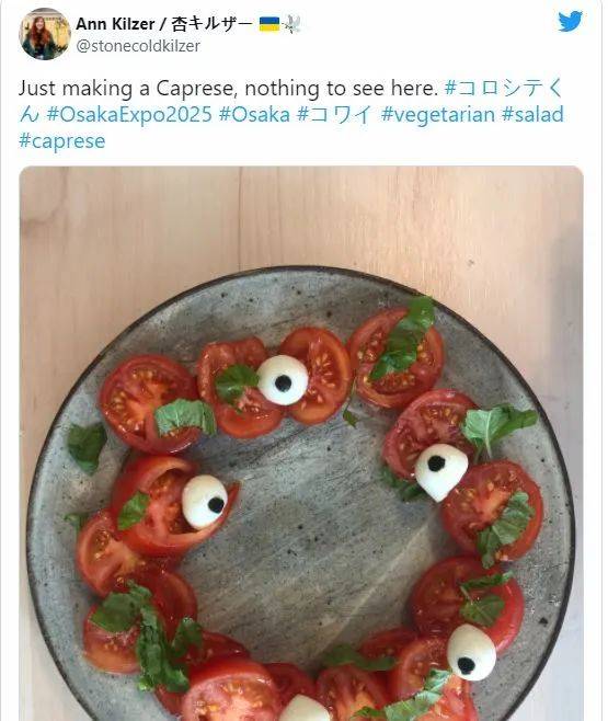
“Just making a Caprese, nothing to see here.”Another user said.
“就是做个意大利番茄沙拉 , 没什么可看的 。 ”另一名用户说 。
A critic stated the design is “bizarre and similar to frog eggs,” while a comment panned it by saying, “The logo appears a new kind of monster, and the googly-eyed part looks creepy.”
一位批评人士表示 , 该设计“又怪异又像青蛙卵” , 而另一则评论抨击道:“这个logo像是一种新怪物 , 曲棍球似的眼球看起来很古怪 。 ”
Although drawing a mixed reaction from the public, the 2025 Osaka Kansai Expo logo has lifted the profile of the event , according to The Asahi Shimbun.the official logo has attracted much interest on the internet as posts call the design either "weird" or "cute," which has helped raise awareness of the Osaka expo.
据《朝日新闻》报道 , 尽管毁誉参半 , 但这个会徽提升了世博会的知名度 。 官方logo在互联网上引起了极大关注 , 有帖子称其设计既“怪异” , 又“可爱” , 这有助于提高人们对大阪世博会的认识 。
以上关于本文的内容,仅作参考!温馨提示:如遇专业性较强的问题(如:疾病、健康、理财等),还请咨询专业人士给予相关指导!
「辽宁龙网」www.liaoninglong.com小编还为您精选了以下内容,希望对您有所帮助:- 服装 穿上定制西服,一年365天都是一个魅力型男
- 94年出生的泰国男明星,身高185,皮肤白皙,穿衣简单又有品
- 内衣 她一胎产后走秀,二胎带孕走秀,维秘最拼的天使,17年不离不弃
- 李宇春 15年了!李宇春这件衣服还在~
- 马伊琍 孙俪织围巾一脸认真,比马伊琍还节俭,一双袜子穿20多年舍不得扔
- 苏提达地位稳定,一身军装打扮飒爽英姿,气场不输给年轻时的婆婆
- 设计 周涛的穿搭跟年龄很般配,印花衬衫+黑裤,素颜也挺有气场的
- 这些50+的女性真会穿搭!高级时髦又不扮嫩,优雅精致又显年轻
- 2022年春天流行“叠穿”!这18套又酷又飒的穿搭,经典又简约
- 画布“玩”毛线成新时尚 年轻人为“亲手体验”买单